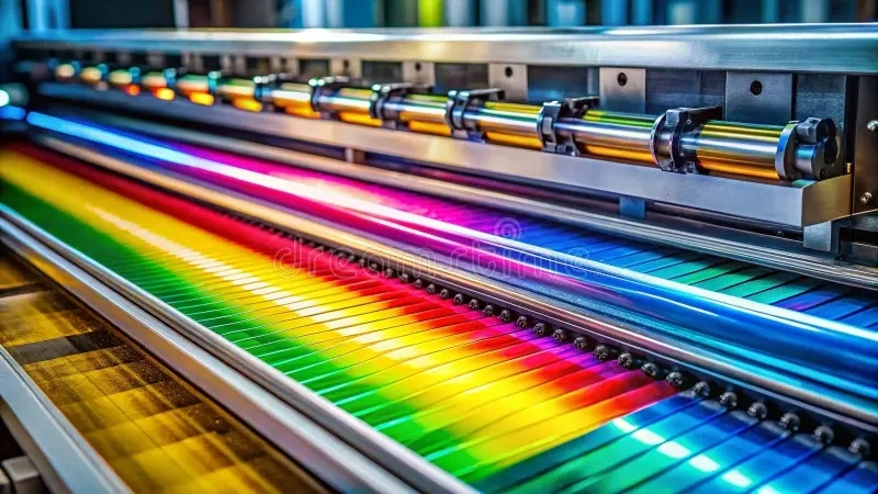
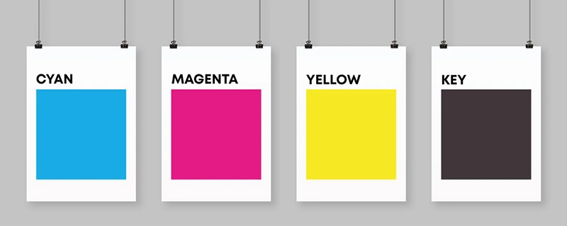
Most packaging boxes use CMYK color mode, which is a four-color separation mode composed of ink combinations of Cyan, Magenta, Yellow, and Key. Through different overlays, you can achieve the color you need. It combines multiple advantages of printing color accuracy, low cost, and mass production, allowing you to quickly obtain your unique color packaging box.
We at XiangGe have been helping over 100 brands design and produce colored packaging boxes. Here, we will provide you with a comprehensive understanding of the importance of CMYK.
Last update: August 2025 | Estimated reading time: 7 minutes
This article will answer for you:
- What is CMYK printing? How does it work in packaging?
- Why is CMYK better than RGB? Why do printers prefer CMYK?
- Advantages and disadvantages of CMYK and how to deal with problems
- Common CMYK problems and solutions in actual printing
What is the CMYK printing
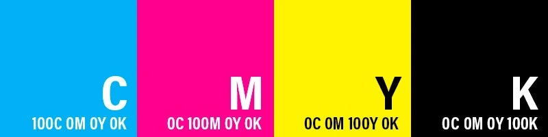
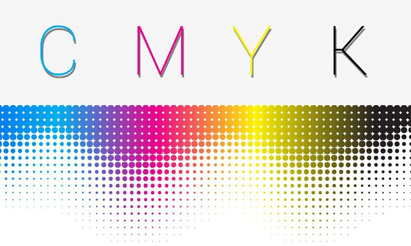
CMYK is a mixture of four inks, Cyan, Magenta, Yellow, and Key, to create the specific color you need. This is the most common print method in commercial packaging. Unlike paint, it is achieved by layering and stacking tiny colored dots on paper.
It is called the ‘subtractive color principle’. Ink absorbs long wave light, while cardboard only reflects a portion of the color into your eyes. Therefore, printing the same CMYK color codes on white paper results in brighter and richer colors than on corrugated cardboard.
It is commonly used in offset printing and digital printing.
How is CMYK used in packaging box design?
Although CMYK can achieve 1:1 restoration of images to the surface of paper boxes, we recommend using 2 colors instead of 3, as the fewer mixed colors, the purer and brighter the printed effect. Try to use colors from one or two channels as much as possible to minimize the likelihood of color differences.
| Printing Method | Use CMYK? | Best For | What It Means for You |
|---|---|---|---|
| Offset Printing | Yes | Large batches (1,000+ pcs) | Low unit cost, high efficiency |
| Digital Printing | Yes | Small runs or samples | Great for quick customization |
| Flexo Printing | Yes | Corrugated boxes | Simple graphics, high volume |
Practical advice:
- Design with CMYK from the beginning, do not convert RGB to CMYK.
- For large areas of black, please use the dark formula (such as C=30, M=20, Y=20, K=100).
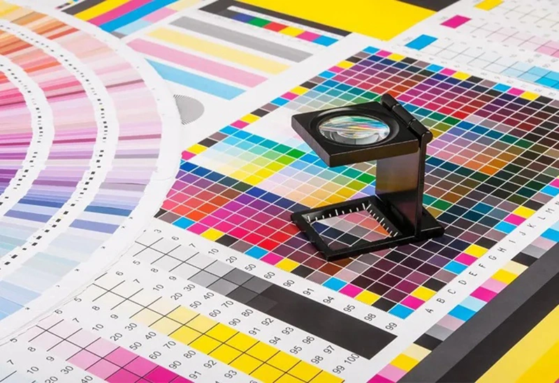
- Before mass printing, it is necessary to make a sample to confirm the printing effect. Don’t just look at the color of the computer screen, it’s easy to have errors.
Real case: When an American skincare brand made its first sample, the pink color turned into earthy brown. The reason is to use RGB design. After switching to CMYK and making a sample on glossy paper, the effect immediately met the customer’s expectations.
For more information on packaging surface treatment methods, please refer to our packaging box surface artwork introduction.
CMYK vs RGB printing: why do printers prefer CMYK?
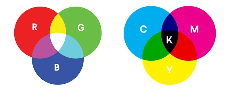
RGB is suitable for screens and digital products, while CMYK is suitable for printing, such as books, magazines, and packaging boxes. RGB is based on the principle of additive color, formed by the superposition of colors; CMYK is based on the principle of subtractive color, absorbing reflected light to form various colors.
The printing machine uses four-color inks (C, M, Y, K) for physical printing, and the ink is overlaid to produce colors that comply with the principle of subtractive color, thus forming the colors required for printing. However, RGB is mainly displayed through light and does not use the printing industry, which can easily cause color distortion.
| Color Model | Best For | Not Ideal For | Description |
|---|---|---|---|
| RGB | Digital screens, websites | Printed materials | Bright and vibrant but not printable with accuracy |
| CMYK | All print applications | Digital display | Best for paper, more accurate color reproduction |
Tip: When designing packaging in Photoshop or Illustrator, choose CMYK mode from the beginning.
Why CMYK is the standard in the printing industry?
More accurate color reproduction
CMYK is reliable because it uses four standard ink colors. It can make the printed effect closer to the design draft. As long as the color is within the CMYK color gamut range, the error will be very small.
Meet most packaging design requirements
CMYK is a universal color mode in the international printing field, which can meet the production requirements of all printing and packaging factories and ensure color consistency.
High production efficiency
Offset and digital printing machines on the market default to CMYK. Our factory has already standardized its production process and will not incur any additional costs.
Disadvantages of CMYK Printing
CMYK printing also has certain limitations:
- The color gamut is narrower than RGB and cannot print fluorescent, metallic, and highly saturated colors.
- The colors of CMYK printed materials are difficult to achieve complete consistency, which requires our engineers to manage and calibrate the colors.
- Converting RGB to CMYK can cause color deviation, which can reach up to 50%. This requires us to design with CMYK from the beginning.
- The material of paper has a significant impact on color expression, and the texture and thickness of the paper can affect the penetration of ink. Therefore, many brands choose white cardboard or copperplate paper for printing.
Common problems and solutions in CMYK color print
Problem 1: Inaccurate brand color
- Reason: Some colors have limited CMYK expressiveness
- Solution: Use spot color printing (Pantone color code)
Problem 2: Black is not black enough
- Reason: Only use K-color ink, or C100, M100, Y100, K100 ink.
- Solution: The blackest black can be used with C50, M50, Y50, and K100.
Question 3: There is a significant difference between screen color and printing color
- Reason: As mentioned earlier, the working mechanisms of RGB and CMYK are different
- Solution: Switch to CMYK before design, sample packaging box, perform color comparison and confirmation.
Question 4: Different batches of the same design have inconsistent colors
- Reason: Differences in ink or paper batches, as well as temperature and humidity in the production workshop, can also have an impact.
- Solution: Specify Delta E tolerance value, select high-quality equipment printers, and strive for color accuracy of over 90%.
The refresh trend of CMYK printing in 2025
Latest Trends:
- Extended color gamut printing (CMYKOGV): adding orange, green, and purple to enhance color reproduction ability.
- The rise of environmentally friendly ink: water-based ink and soybean oil ink are becoming mainstream.
- Intelligent sampling system: can predict the final color performance on different materials.
For small and medium-sized brands, this means achieving high-end visual effects with a lower budget.
FAQs
Yes. Using water-based or soybean oil ink is more environmentally friendly than traditional solvents.
Design in CMYK mode, especially when dark colors are required, it is necessary to make a physical sample and choose a reliable printing factory, such as our XinagGe Packaging
no way. Specialized metal or fluorescent ink is required, CMYK cannot be simulated.
The display screen is in RGB mode, with bright colors. The color of the paper will darken after absorbing ink.
Conclusion
- CMYK is a four-color system that is suitable for almost all packaging printing, including green, yellow, and black.
- Low cost, good effect, high precision, it is the most practical printing method.
- Pay attention to color gamut limitations, black grayscale, and the impact of paper on color.
Next suggestion:
- Design packaging using CMYK mode from the beginning
- Sample making must use actual paper material
- Use spot color Pantone for key brand colors to ensure consistency
- Collaborate with printing factories with color management capabilities
About XiangGe Package
We have over 10 years of experience in the packaging box printing industry and are well aware of the brand’s requirements for color consistency. We offer:
- Professional CMYK printing services (offset printing+digital)
- Free design templates, black blending support
- Provide physical samples to ensure that the results meet expectations
Do you need CMYK packaging box printing solution? Contact us for free samples or professional advice.
Last update: August 2025