Last updated: August 2025 | Estimated reading time: 9 minutes
This article will answer your questions
- How to create a satisfactory product packaging design with a clear goal.
- How to choose cardboard and fluting type according to strength.
- How to implement box shape creativity into cutting lines, fonts, product information, colors and craftsmanship.
Why is product packaging design important?
High-strength cardboard can be effectively punctured or deformed. Clear product information, including ingredients and instructions, can reduce returns. Good design can add value to a product and make it stand out on the shelf.
Strength Quick Pick (ECT vs Mullen)
ECT, or Edge Crush Test, indicates higher stacking strength and load-bearing capacity. This is commonly seen in e-commerce and 3PL companies.
Mullen = Bursting Strength. This is typically measured as a measure of a material’s resistance to puncture and tearing. A higher value indicates greater durability. It’s commonly used for general cargo and mixed shipments.
| Selection Guide | Usage Scenario | Metric Meaning | Practical Significance |
|---|---|---|---|
| ECT Rating | Parcel and stacking scenarios | Edge crush lbf/in | Plan pallet height and safe stacking |
| Mullen | Routes with high puncture risk | Burst strength psi | Better resistance to rough handling and mixed loads |
| McKee | Quick estimation | BCT ≈ 5.9 × ECT × board thickness (inches) × √perimeter (inches) | Compare options before sampling, used to evaluate compression strength |
Tip: 3PL refers to national standards such as GB/T24359-2009. We will clarify the testing and acceptance criteria with customers to avoid subsequent disputes.
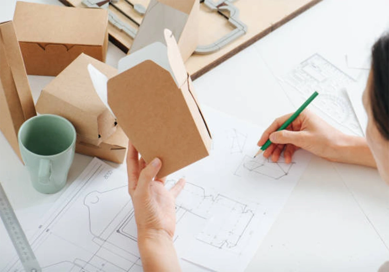
How to design product packaging more creatively?
What is your product type?
Choose the structure based on weight, sensitivity, transportation distance and surface. Below are three common product packaging solutions.
- Electronic products: E-flute + paper pulp support. Leave 10–20% space as buffer space.
- Clothing: E-flute mailing box with tear strip and self-sealing seal.
- Heavy Freight: BC corrugated shipping boxes, 44–51 ECT or 275–350# Mullen.
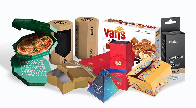
What's your packaging box type?
- Mailing box (buckle): Mainly made of lightweight materials without sacrificing protection, quick assembly, and good unboxing experience.
- RSC transport box: simple structure, easy to assemble, convenient for repeated sealing and secondary use, suitable for large-volume packaging orders.
- Gift hard box: The thickness is between 3mm-6mm, and there are many shapes such as heart, star, and hexagon. It is generally equipped with inner support for protection and has a beautiful appearance.
| Board & Flute Type | Typical Thickness | Best Application | Practical Significance |
|---|---|---|---|
| E Flute | ~1.2–1.5 mm | Retail printing, small items | Sharp graphics, lower cushioning |
| B Flute | ~2.5–3.0 mm | General e-commerce | Balance between strength and cost |
| C Flute | ~3.5–4.0 mm | Needs cushioning | Better shock absorption |
| BC Double Wall | ~5–6 mm | Export, heavy goods | High stacking strength, less box collapse |
Humidity is critical. A moisture content of 8–12% is most stable. Strength can drop by 30–40% at 80% RH. Store cartons off the floor. Use PE-laminated kraft paper for wet routes.
How to choose a font?
Choose elegant, sophisticated fonts like Didot and Bodon, or modern, lively fonts like Helvetica Neue and Gotham. Minimum font size: 8–9 pt for coated surfaces, 9–10 pt for vellum.
Avoid excessive font usage; excessive fonts can create a cluttered and disorganized appearance. Leave ample quiet space. Avoid printing small characters on top of indentations or corners.
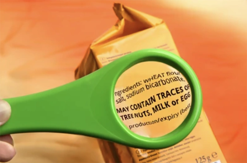
How to put product information on the box?
Only include information that can help you pick out the product and its ingredients and usage.
- The brand and product name should be placed in the main visual area
- SKU + barcode should be placed in the auxiliary position, with a quiet zone ≥ 10× narrow bar width
- Orientation chart (ISO 780) placed near the opening
- Compliance markings: only necessary ones, such as CE
Key information: The distance from the edge to the pressure line is ≥ 3 mm.
How to choose brand colors?
The inter-batch color control target is ΔE ≤ 3.
Make samples on real materials instead of just looking at white paper samples.
What are the common surface treatments?
- Water-based coating: scratch-resistant, suitable for food contact.
- UV coating: Highly wear-resistant and chemical-resistant. Partial UV coating can enhance the three-dimensional effect of the pattern.
- Lamination: Provides protection, waterproofing, stain resistance, and texture, but is more difficult to recycle. Use only when necessary.
Practical rules for product packaging design
Pressing line: Too deep will cause cracking; too shallow will cause springback. The cutting line should match the plate thickness.
First, create the cut line: Use inner length × inner width × inner height. Add product tolerance and buffer, and then add 2–3 mm assembly allowance.
Corrugated design: refer to the table below:
| Type | Flute Ratio | Flute Height (mm) | Flutes per 30 cm |
|---|---|---|---|
| A | 1.52 | ≥4.5 | 34±2 |
| B | 1.36 | ≥2.5 | 34±2 |
| C | 1.47 | ≥3.5 | 38±2 |
| D | 1.26 | ≥1.1 | 96±4 |
Barcode and layout key points
- The barcode should be placed in the lower right half of the back for easy scanning.
- If possible, print along the fluting direction.
- The barcode size refers to the national standard GB12904.
- Choose a dark barcode color and a light background color to increase the scanning success rate.
- The barcode should avoid pressure lines and corners.
- Bleeding 1.5–3 mm. Key information ≥ 3 mm from cut.
Sealing and palletizing
- Mailing box: buckle + self-sealing + tear strip.
- Shipping box: H-shaped seal or water-activated tape.
- Pallets: Keep the edges even and not bulge outward. Unless vibration is required, use inline stacking. Avoid deformation of stretch film.
Testing, QA, and compliance in 2025
- ISTA 3A (package) or 2A (full case), 1.2 m corner drop pass.
- 24–72 h Stacking to target load (safety factor ≥ 5× pallet load).
- Before testing, the humidity was adjusted to 23℃/50%RH.
AQL: Printing 1.0–2.5; Structural 0.65–1.0.
Required tests: ECT/Mullen, thickness, crimping, adhesion, BCT, drop.
Food contact? Keep your FDA / EU 1935/2004 documentation handy.
FSC should only be used when you can control the entire link.
Cost reduction without compromising performance
- Custom made to size, less air.
- One inner tray is compatible with multiple outer boxes.
- Standardize on 2–3 footprints.
- Use 1–2 spot colors for shipping boxes.
- Replace light-weight paper in low stacking layers.
Common mistakes made by beginners
- Insufficient folding resistance of the base paper leads to fiber breakage, which results in cracking. Is cracking common in the lining paper? Consider switching to a harder cardboard.
- The glossy film on the rough card → The film is peeling off. Use water-based ink instead and adjust the viscosity before use.
- Large window opening with small flange → prone to cracking. Flange ≥ 12 mm.
- E. Dark color on full-edge printing plate → Collapse. Add paper pad or reduce pressure.
Getting started scenario specifications reference
Electronic product retail box: E-flute with color mounting, ΔE ≤ 3, PET window ≥ 0.3 mm, flange ≥ 12 mm, with pulp tray.
Heavy-Duty Export Shipping Boxes: BC fluting, 44–51 ECT or 275–350# Mullen, water-activated tape, moisture-proofing solution.
Gift boxes: 1200–1400 g/m² grey board with correct paper texture, corner tape, magnetic pull < 0.6 kg.
Product packaging design trends in 2025
Smart, interactive packaging is becoming mainstream, with QR codes and other technologies enabling rapid traceability. Sustainable coatings are becoming increasingly effective. Many brands are beginning to track their carbon footprints. Brands are also favoring minimalist styles, abandoning complex graphic designs. End consumers are no longer solely focused on appearance; material texture is also becoming a key concern.
- Optimize the size first: reduce the probability of carton damage.
- Lightweight process: easy to recycle and low cost.
- Size by route: ECT or Mullen aligns with 3PL.
Action suggestions and tools
- The goal is to reduce damage: increase ECT by one level; or just add BC on the top layer.
- The goal is brand texture: the structure remains unchanged, only a soft-touch water-based layer is added to the cover.
- The goal is efficiency: with an automatic locking bottom and pre-laminated tear strips.
FAQs
Planning the box's protection function, information transmission and consumer attraction functions. It covers a complete packaging design process including size, cardboard, printing and craftsmanship.
ECT is used for stacking and is suitable for parcel networks. Mullen is used for burst resistance and is suitable for routes with high puncture risk.
It is a key term in packaging design and refers to the template lines on the package flat unfolding drawing. It contains cutting lines, folding lines, perforation lines, and is used as a manufacturing guide.
The effective packaging gap is 20% to 30%. If it is too full, the carton panels will be pressed and the empty space will cause shaking.
The barcode size is the standard size of EAN/UPC SC (approximately 37mm wide and 26mm high)
Conclusion
First, determine your primary goal. Then, choose the paperboard and fluting type based on that goal. Use the internal dimensions for the cut lines. Keep the fonts, colors, and crafts simple. Test your approach. This will ensure a more stable product packaging design.
Next step: Request cut lines and white samples. Perform an ISTA test. Record damage and collapsed boxes, and use data to adjust the cardboard and inner trays, rather than just modifying the artwork.
About XiangGe Package
We create custom packaging for numerous global brands. We specialize in strong construction, clean printing, and on-time delivery. We provide cutting, testing, and export documentation support.
Looking for a universal cutline template or sample pack? Get your free cutlines now.
Recommended internal links: